Thursday, October 16, 2014

Color on Developing Characters and Story - Kathy & Frank Whitaker - Far From Heaven 2002

Far From Heaven was created as a homage to 1950s Hollywood melodramas, cinematographer Edward Lachman was nominated for an Oscar for this film.
A still frame of bright red-orange leaves fills the screen as the title sequence begins. As the camera pans slowly over the block the leaves gradually turn brown. By the end of the block the leaves disappear completely and the trees are left bare. In less than sixty seconds, in pure visual language, we have just seen a perfect synopsis of the story.
Kathy's street is full of beautiful warm colours. A bit over saturated in fact, as if they were trying too hard to be perfect. Kathy's best friend arrives in a pastel pink two tone sedan. They have to discuss a party they are hosting soon. These are very busy women living in a perfect pastel world where everything is in its place. Or so it seems. Later that night the phone rings. It’s the police department, Kathy's husband Frank has been arrested. The way the director Todd Haynes introduces Frank says everything about his character. He is giving his back to the camera, facing a lime green wall.
Frank's world is represented as a distortion of nature's primary colours. His world is full of lime greens, magentas and secondary colours. When Kathy goes to the Police Station to pick up Frank you can see she doesn't belong there. Lime green is all over the place. Even his workplace has this lime green tint. It’s obvious now that he represents almost the opposite of what Kathy is. One night after work, he sees two men laughing on the street and decides to follow them. They walk through a dark alley. Frank hesitates but with caution decides to continue. This is a decisive moment for him, director Todd Haynes decides to use a tilt angle to reinforce this feeling. He is giving us a clue that something wrong is about to happen. Something is not right, something is crooked, like Frank.
In the 50s, homosexuality was considered an aberration. That’s the reason that Lachman uses colours that are not pleasant to the eye. When Kathy catches Frank one night with another man we see again the same tilt angle, only this time we see Kathy running away. They try hard to save the relationship but we can see more and more cold blue and purple entering Kathy's world. She can only find some glimpses of happiness in her sporadically chats with Raymond, the colour gardener that works for the family. Raymond is everything Frank is not in many ways. He's always represented by earthy colours. However we see a similar green atmosphere when Kathy goes with Raymond to a restaurant, indicating that a married white wife going with her black gardener to a restaurant isn't well seen either. 
"Far from Heaven takes place over different seasons, which are a metaphor for what’s happening to the characters emotionally. To suggest the emotional arc of the story, as the seasons changed, the night becomes an emotional texture for Frank and Kathy’s world coming apart. The fall night is more of purplish blue in transition to winter. As their relationship disintegrates and winter comes, it became more of a greenish blue, more of an acerbic night depicting the character’s isolation. As spring begins, the light becomes a purplish blue once more. It is a new beginning" Edward Lachman
So much to see and analyse on this film, so many different readings that is impossible to summarise. I'll finish it with another quote from Edward Lachman "The surface beauty of the characters’ world becomes its betrayal. It’s a beauty that they can never be part of. Ironically, they are seduced by what keeps them from their desire. The beauty points to something it denies. Kathy is always moving through all these different worlds in her picture-perfect environment, but somehow never obtaining the emotional stability of what middle class life is supposed to reward you with" 

Wednesday, October 15, 2014

Color on Developing Characters and Story - Jerome Morrow - Gattaca 1997

Colour affects our emotional perception of the world.  It speaks to us on such a primary level that we barely think of it. It is there not to be seen, it is there to be felt. To understand how green can be used to reveal a character’s state of mind and personality, we can use the example of Jerome (Jude Law’s character) in the film from 1997 Gattaca.
Jerome Morrow is a genetically improved man. He lives in a world were eugenics is common, and DNA plays a primary role in determining social class. His destiny is to always be the best. But after a car accident he is now just a cripple on a wheelchair. So this is the way that director Andrew Niccol chooses to introduce him. Smoking a cigarette, Jerome is backlit with this almost toxic green light.

With this shot you can read very clearly Jerome's state of mind. You can read it on his face, on the green mouldy walls of his apartment, on the empty bottles of alcohol on the floor, on the unhealthy yellow green colour of his skin, on the wheelchair, the cigarette... it’s a fantastic master piece of character exposition.

Green is a colour that presents a duality. In its plant manifestation, it signals life itself. However green in the atmosphere, water or skin can be read it as toxic or unhealthy. “Beware of the green water” is a sailor’s warning, "You look green,  you must be sick" is another common saying.

Now, if you haven't seen the movie stop reading right now, watch the movie first and come back because I'm about to give away key moments of the movie. Vincent (Ethan Hawke) narrates at the beginning of the film how he was conceived in the back seat of a car as "faith birth". The colour Green appears this time not as a toxic environment but as a metaphor of life. However, Vincent's father disappointment on his son’s natural abilities makes him decide to visit a genetic enhancing clinic and make sure he gives his second son the best genetics tools to succeed in life.
And that’s how Anton is born. You can see from now the green colour shifting and privileging one kid over the other. Anton's clothes are always using different shades of greens while Vincent is left with more brownish earthy tones in his wardrobe.
The drama that propels the story is Vincent’s life obsession to go to the space. This is a story about commitment to a dream. About how he doesn't have any other choice left but to take another man's identity to be accepted in Gattaca. “Each day I would dispose of as much loose skin, fingernails, and hair as possible to limit how much of my INVALID self I would leave in the VALID world. At the same time, Jerome would prepare samples of his own superior body matter so I might pass for him.” His voiceover explains.

When Gattaca’s Mission Director is murdered, and through a discovery of an INVALID eyelash, Vincent becomes a suspect. The lead detective is Anton Freeman. But despite his best efforts Anton can't unmask Vincent. Filled with anger that his own brother couldn't stand to lose to him Vincent shouts to Anton:
"You wanna know how I made it?  I never save anything for the way back" alluding to a swimming game they used to play when they were kids in which the first one to get scared or exhausted and swim back to shore would lose. At the end of the film we see how colours support the characters in a different ways. Jerome gains and changes so much helping Vincent that all the green has disappeared from his environment. He gives a letter to Vincent to be opened only when he is in space. Vincent says, “I don’t know how to thank you.” Jerome replies, “I got the better end of the deal. I only lent you my body. You lent me your dream.” Vincent will walk through a green tunnel that leads to a spaceship that would take him to the stars.

Friday, September 26, 2014

Camera Obscura Portraits for Everyone

After 2 years spent perfectioning this technique, I'm happy to finally offer this special type of portrait to anybody looking for something different and of unique value.

Using techniques available since Leonardo’s days (without Photoshop), I aim to give you the most complete and compelling portrait you can get. Showing not only yourself, but also your most personal space and the view you see/wake up to every morning from your window, projected on you. All that, by using only natural light.

BOOK IT NOW (for October and November)
Phone: 0415639223
Email: info@mauriciodelarocha.com

Price: starts from 300$

Tuesday, June 3, 2014

The House of Screams

The mind is without a doubt, a complex and fascinating place, full of light, doors that open and close, secret passageways and hidden places.  The mind is capable of doing surprising things and at times, when it is bored, it can pass the time creating irrational thoughts.

I like to think that ideas are always inside oneself and live kept in one’s head, resting and waiting for that stimulation that will let them know when it is time to leave the nest and enter this world.  The interesting part comes when they are never provocted, when the mind is bored.  They can seem like innocent day dreams, or a distraction, a change in scenary or a tirp to another world.  However, when one mindlessly drifts off, the ideas do not escape.  This is what is most frustrating. Impatience errupts, they yell at eachother and stop listening to one another.  Many try to get out but through the wrong door.  Anarchy opens way and the house is turned into chaos.  

Only when the mind decides to end its game, will it turn on the lights, open all the doors, and with a great force, expel all escaped turmoil.  It is then, when control will be taken back, and reasoning will be ceased.

Mauricio, Buenos Aires, 2008


Is unusual that I come back and work again on previous projects. However The House of Screams has a very special meaning for me. Was my first real attempt to tell a story with photographs. A few weeks ago I though it would be interesting replace the original 18 photographs from the series and make a slide show with some music. I love the result. Below is the original text I wrote in 2008, in spanish of course.

La Casa de los Gritos

El cerebro sin lugar a dudas es un lugar fascinante mente complejo, lleno de luz, puertas que se abren o cierran y pasajes secretos a lugares desconocidos. La mente es capaz de hacer cosas sorprendentes, y a veces cuando esta aburrida mata el tiempo tomándole el pelo y jugándole bromas a la razón. 

Me gusta pensar que las ideas están desde siempre dentro de uno, que viven guardadas en la cabeza, descansando y esperando el estimulo correcto que les indica que es hora de dejar el nido y salir al mundo. La parte interesante empieza cuando los estímulos no vienen, cuando la mente se aburre. Puede al principio parecer un inocente sueño diurno, o tal vez una distracción. Un cambio de escenario o un viaje a otro mundo. Pero mientras uno divaga la verdad es que las ideas no salen. Y eso definitivamente las frustra, se impacientan rápidamente, empiezan a levantar la voz pronto dejan de escucharse entre ellas, muchas intentan salir por la puerta equivocada. La anarquía se abre paso y la casa se vuelve un caos.

Solo la mente cuando decide terminar su juego ordena apagar las luces, ordena abrir todas puertas y con un estruendoso sonido expulsa a todo anarquista suelto. Es ahí cuando retoma el control, y se lo cede a la razón.

Mauricio, Buenos Aires, 2008

Wednesday, April 30, 2014

Portrait of a Photographer

Scott McGale Portrait from Mauricio De la Rocha G on Vimeo.

Scott is a highly regarded professional photographer with nearly 20 years experience. He began his photographic career in London, and worked there as a pro for 12 years before returning to his native Australia, and now resides in Sydney. In 2008, he started teaching photography where he developed a real passion for teaching that has led to the opening of Photo Workshop Australia

Wednesday, April 23, 2014

Workaholism as a Creative Block

Workaholism is an addiction, and like all addictions it blocks our creative energy. If we're too busy to write a play, to finish that paint, to take that sailing class, or to shoot that film, we're probably too busy to listen to our creative inner voice. Rather than trusting our intuition, our talent, our skill, our desire, we are afraid of where this creative energy could take us and we choose to be blocked. At least when we are blocked, we know who and what we are, unhappy and incomplete people. Once unblocked, we may experience something way more threatening… happiness.

Excess of work is only one of many creative blocks. The need to be a great artist makes it hard to be an artist. The need to produce great work of art makes it hard to produce any art at all. We need time for that and we're too busy working.

Do not call it procrastination or laziness. Call it fear.

Creativity requires activity. And most of us hate doing something when we can obsess about something else instead. We all have creative blocks. Work has been mine since the beginning of the year. It is good to take some time off now, step back and take stock of the situation in order to return to the doing column.

It’s funny how the mind works. After 4 months of not sharing what I think or do, doubts started popping in my head, such as, what if what I'm writing is not good enough to even share it? Writing this few lines made me very happy this morning. Because, in my case, writing about what I'm doing or thinking, helps me keeping some of my fears away.

Working is good, don't get me wrong. Actually, it is essential in order to create something. It is the abuse of it that makes it a creative issue. Having the time, and taking the time to try new things, learn new skills, and try new experience is mandatory to stay creative.

Mauricio


"Question: Do you know how old I'll be by the time I learn to play piano?
Answer: The same age you will be if you don't."

-Julia Cameron

Tuesday, January 7, 2014

Colab Eyewear


It was a pleasure to work on this video for the people of Colab Eyewear, their sunnies are truly amazing. My personal favourite is the Askill model for different reasons.., I love the design of course, but I'm also a huge fan of the Askill brother's art work. In fact Daniel and Lorin have been a source of inspiration for my photographic and film work in many ways.

Photography by Petter Karlstrom
Styling by Leigh Karlstrom
Hair and Make Up by Shelly Lin
Models Kristina Agioski & Bryce Sykes
Music by Psychic Ills - I'll Follow You Through the Floor

Wednesday, December 18, 2013

Night Ghost Stories Unveiled - Part 1


For my 100th post I am revealing some of the portraits of The Night Ghost Stories Series. What a cool coincidence. 

The best way to describe it, is as a very playful photographic experience. The photos are the result of a brainstorm of ideas blended together between the subject and myself. It's like a flashback in childhood when you are going back and forth creating the rules of a new game, and somehow it seems to bring out the inner artist from us. I find necessary this type of projects as a creative recovery exercise. Same as the last project I only use on camera techniques and no photoshop at all.

The complete series just came back from the Nexus exhibition in Canberra and will be showcased at my gallery (95 Sydney Rd, Manly, NSW 2095) for an undetermined period of time. This project is, by the way, still open for any volunteer from Manly and Norther Beaches, who wishes to participate.

"Every child is an artist. The problem is how to remain an artist once he grows up" - Pablo Picasso

Tuesday, December 3, 2013

ROC Boots "High Summer Neo Campaign”


Photography by Petter Karlstrom
Styling by Leigh Karlstrom
Hair and Make up by Vanessa Collins
Music Grimes "Oblivion"

Film & Edited by Mauricio De la Rocha G

Tuesday, November 12, 2013

Camera Obscura in Colour


Visually speaking, colour helps to tell stories. It can be used to add another layer of depth in a composition, or/and as a tool to communicate on an emotional level with the viewer. I’ve been thinking lately that maybe leaving the colour on the camera obscura portraits can make it easier for observers to see the pinhole effect. 

So the only way I can think of confirming this thought is to test it. If you have a minute drop me a line, txt me, call me, what ever is easy for you… Colour or B&W

Tuesday, October 1, 2013

Nexus - Reflections & Interpretations


Now is the turn for the "Night Ghost Stories" to be showcased. After a quick time on the windows of  my studio for the Manly Arts Festival 2013. It's time to  wrap again this series and send it to the Australian capital for another exhibition.

Tuggeranong Arts Centre Community Cultural Inclusion Program will present the art works of fifteen artists from diverse backgrounds in: "NEXUS - Reflections & Interpretations"  

NEXUS explores issues of identity including the sense of loss, belonging and the acquiescence of local and intercontinental culture. This exhibition is a collection of work by fifteen contemporary artists: Latin American artists who live in Australia and oversee and Aboriginal Artists who live in Canberra. It is intended that the exhibition encourage and facilitate an ongoing discourse between the artists, audi- ences and their international communities.

Within this vibrant and extraordinary exhibition the viewer can discover a wealth of cultural insights through the magnificent works of photography, installation, print, painting and silverwork that comprise this wonderful collection.

The exhibition shows from October 10, 2013 until October 29, 2013 in the new gallery space at the Tuggeranong Arts Centre.

Hope you enjoy it.

Mauricio

Tuesday, July 23, 2013

Nathalie D. & Escapade Shoes


Filmed a while ago and just to add some colour to this winter, please enjoy Nathalie in a colourful BTS from the Escapade Shoes A/W Campaign 2013 on one of my favourites tunes "Que Sera" from Wax Tailor.

Photography by Petter Karlstrom
Styling by Leigh Karlstrom
Hair & Make Up by Chisato Arai
Film & Edited by Mauricio

Tuesday, July 9, 2013

Portrait Of a Fighter


I’ve been a huge fan of combat sports since I can remember, especially because of the mental aspect of the game. This is a project that has been in the back of my head for a while.  Having done more fashion films than anything else, this was a good opportunity to explore a bit more about the storytelling side that naturally comes with the portrait genre. Shot it in less than 4 hours and edited in 2 days, this is definitely not going to be the last film portrait I do. It’s a terrific exercise to explore, try and polish different storytelling techniques. One of the best ways to improve your craft is breaking down and emulating the work of the masters that you follow, so, in this case I tried to mimic the style of one of my favourites directors of photography - Phillip Bloom. From the visuals to the sound, I'm getting a deeper understanding around where my strengths and weaknesses are. I can also get a sense of my own gear limitations and how far I can push them.

Having said that, I hope you enjoy this portrait of Matt Peters, shot it inside the Manly Fight Gym

Mauricio

Tuesday, June 18, 2013

Ollie & The Chitticks


This was by far one of my favourite days at work. No doubt about it. I mean, waking up early in the morning, going to a farm, listening to live music performed by The Chitticks all day long, well, some might say, it doesn't really qualify as a regular Tuesday at work.

We had a great atmosphere, which was the combination of Karlstrom Creatives' great work and the incredible vibe coming from Ollie, The Chitticks and the rest of the crew.

Regarding my work, I must say, I am pretty pleased with the way I used colours to reinforce the storytelling. As I said in my last post, having a deep understanding of how the colour affect our emotional perception of the world, can transform something simple into a visual experience.

I'm also very happy both of my ROC videos are displayed in New Zealand as the brand is also known there.

Now I will let you enjoy the BTS from ROC Boots Deep Winter 13' Campaign, Ollie & The Chitticks "Bath Salts"


Photography by Petter Karlstrom
Styling by Leigh Karlstrom
Hair & Make Up by Karen Hoopwood
Song by The Chitticks "Bath Salts"
Model Ollie Henderson
Film & Edited by Mauricio De la Rocha G

Monday, June 10, 2013

The Power of Colour


Colour influences our choices, our opinions and our emotional state. Our feelings of euphoria or rage, calm or agitation can be intensified or subdued by the colours in our environment. Each colour affects us uniquely. Even the slightest variation of a single colour can have a profound influence on our behaviour. This is powerful information in the hands of a filmmaker.

Not too long ago, colour grading was viewed as a black art and its more renowned practitioners enjoyed rock star status. They had the power to make everyone's work look great, or terrible.

Ironically, colour is one of the elements rarely recognised by the audience as manipulating them. Working on a subconscious level, it's remarkable how colour operates as a psychological tool in order to put the viewer in a specific emotional place, therefore, provoking a reaction from them.

With the new arsenal of digital tools available, the range of options for colour grading has grown dramatically in recent years. There are also hundreds of resources online that explain in detail through tutorials how to replicate the "look" and colours from almost any movie. However, there are almost no websites, (as far as I am concerned) that explain or talk about the creative aspects of colour grading and how to use colour as a storytelling tool.

Today the line between director, cinematographer and colourist is increasingly blurring. If you are wearing one or all of these hats and you remain unaware of this power, you leave a large part of your control to chance.

Like Patti Bellantoni says in her absolutely brilliant book "If It's Purple Someone's Gonna Die", a book that explores how colour affects our emotional perception of the world. She makes us aware of the visual path in our brain and how a film touches us, dissecting colour and its presence in film:

"The green brick road, the yellow shoes, and the ruby red city. Doesn’t work, does it? It’s because those specific colours send specific signals for specific intentions in the story. It is important to remember that in 1939, when the The Wizard of Oz was made, audiences were viewing films in black and white, and so it was brilliant for the filmmakers to expose the audience to black and white in the beginning of the movie so that they too could experience the incredible shock of the exotic and bizarre Technicolor world along with Dorothy."


Tuesday, May 14, 2013

Camera Obscura Portraits Unveiled - Part 2


"Creativity is an act of rebellion by definition. If everybody accepts what I'm doing when i'm doing it.. I'm in wrong path, I should better go and spend my day at the beach instead" - Allan Snyder

Tuesday, April 30, 2013

Camera Obscura Portraits Unveiled - Part 1


"Look at the portrait upside down and you would see the view they have every day"

Tuesday, April 23, 2013

Night Ghost Stories


(testing many different things for this new project)

First of all, I want to thank you all for the great response I received for The Camera Obscura Project. The interest and support from the community gave me the chance to meet amazing people and I had a great time photographing them. However the exhibition Confluencias at the MOF is over, so I brought those portraits to showcase them here, I hope you’ll enjoy them.
 
That being said, I’d like to invite you again to try a different type of photography. This new Project is called "Night Ghost Stories", and consists in a series of night portraits in which I’ll try to capture and show a personal side of you but in a different way. Mixing moon light and artificial light, this is pretty much the complete opposite technique to the one I used in the Camera Obscura. 
 
(planning to use some techniques I used in the past like flash and movement)

With this new project I continue my original idea of giving back to photography the importance of creativity and mysticism it deserves. Something systematically forgotten in the past few decades. Offering you at the same time a very unique portrait / experience... for free. And I promise you will value it more than any other (paid) one.
This portrait will take a bit of your time and mine. I need your help to bring some of that magic back, and show a different way to take pictures, in a time where everybody has access to a camera but chose to take the same type of photo all day, every day. 

So like last time, if you’re interested and want to pose for me, please don’t hesitate to give me a call, send me an email or text, or just come to see me at my gallery. And if you have friends that you think might be interested share it with them through Facebook or Tweeter, that makes a big difference.

Thanks

Mauricio

Phone: 0415639223 Email: info@mauriciodelarocha.com

Tuesday, April 16, 2013

RAD RATS


Otis Carey, Maddison P, and Suzi Leenaars in RAD RATS (BTS)

Photography by Petter Karlstrom

Styling by Leigh Dalton
Hair by Linh Ngyuen
Make Up by Kristyan Hearts Low
Film & Edited by Mauricio

Wednesday, March 27, 2013

Sneak Peek Video from Confluencias Opening Night


The Opening night at Confluencias gave me the amazing opportunity to meet many artists from Australia and Latin America. I also had the chance to talk with consuls representing Argentina, Brazil, Ecuador, Peru and Uruguay. However, the highlight for me was to meet and chat with Her Excellency Professor Marie R Bashir, Governor of New South Wales.

Below is a sneak peek video from the Opening Night.


This is a unique opportunity to appreciate the Treasures of the Museum of Freemasonry empowered and juxtaposed by Australian and Latin American art. If you live in Sydney you should not miss it. Remember you only have until the 7th of April... Hope to see you there.

Mauricio

Wednesday, March 20, 2013

Vesper Rose - In the Garden of Good and Evil


Ladies and Gents, I leave you with the beautiful Emily Green on a BTS for Vesper Rose Jewellery Collection 2013.

Photography by Petter Karlstrom
Styling by Leigh Dalton
Hair & Make Up by Chisato Arai
Film & Edited by Mauricio

Monday, March 11, 2013

Confluencias: Australian & Latin American Art


Finally the day has come, and the "Camera Obscura Project" I started in August 2012 is gonna see the light as part of  "Confluencias: Australian & Latin American Art". This exhibition is made possible by a partnership with the General Consulates of Argentina, Brazil, Ecuador, Peru and Uruguay. And is gonna be hosted by the Museum of Freemasonry (MoF) - 66, Goulburn Street, Level 3, from 18 March to 7 April (Monday to Friday) 9:30 - 17:00. 

Above is the Press Release:


"AUSTRALIAN & LATIN AMERICAN ART IN COVERSATION

In order to celebrate the 125th anniversary of the first Grand Lodge in NSW & ACT, the Museum of Freemasonry (MoF) in Sydney presents the exhibition Confluencias: Australian & Latin American Art, which will showcase works by contemporary Australian and Latin American artist. Their works will mingle and merge with MoF's imposing permanent collection. Objects of art and artefacts within the Museum include portraits, lithographs, panels, silverware, medals, swords, pottery, symbols and logos; traditional paraphernalia of historical significance. Embedded within ancient Masonic ritual and rite the Museum's collection will morph into synthesis with twenty first Century objects of art. 

This innovative way juxtaposing and viewing and reviewing art, will add depth to the context in which the contemporary works can be interpreted, while exploring philosophical ideas, metaphor, and symbolism common to both. Presenting contemporary art in the Museum's collection is a fascinating and a creative curatorial model. One that serves to transport the imagination: The contemporary and fine art works will seem to either merge or stand-alone. This model in the context of the Museum's collection generates new perspectives of thinking and doing. In this sense, art is presented as unpredictable, challenging and effervescent.

Australian and Latin American Art

Latin American art exhibited in Australia generates the opportunity for artistic encounter: A coming together or confluence of artistic ideas. Contemporary Latin American works will be seen and interpreted through a confluence of thoughts, signs and ideas when viewed and presented alongside MOF's collection.

The exhibition will look at the practice of some Australian artists while on residency projects in Latin American countries; and at works by Latin American artists working in Australia. Frequently their approach is universal and contemporary, while remaining Latin American at its core.

Australian artists not linked to Latin America are also presented in the exhibition. Their works afford a different standpoint when considering the issues that haunt mainstream contemporary life. Topics such as identity, migration, the sense of loss and belonging; and the acquiescence of local and intercontinental culture. For many people these issues remain an unrelenting challenge to contemporary life. They represent a contemporary predicament, inherited from the twentieth Century. Art has a powerful role to play in society. The voice of the artist can resonate and inspire. It becomes an astonishing enactment, a demonstration of solidarity."

I hope see you guys there.

Mauricio

Wednesday, January 23, 2013

Take aways from 2012

I can honestly say that 2012 was about rediscovering myself again. This year was a very big learning curve on many different levels. On a personal level, I was introduced to new mentors to follow and consolidate new passions like filmmaking.  Now I want to make 2013 the year of taking control of all the things I've learned, and enrich my life as a result.

Ironically I haven't worked for the past 2-3 months. In fact, I've been spending all my time running, swimming, snorkeling and more recently, surfing. It has been a great way to evaluate and digest my performance from last year, screening all the information I've put in my head in the last year or so, and turning it into some kind of strategy and philosophy to live my life by.

I know I have to stay sharp and on my toes. Because life is like a race, and there will always be somebody breathing on your neck willing to run that extra mile and climb higher than you. But also you have to know how to keep composure, fight your natural instinct of blindly trying harder just because something is not giving you the results you want. Pace yourself. Hold back if necessary, and you will likely walk away the winner. That's my biggest take away from 2012.

It's very clear that being good at your craft is not enough these days. So I have to keep learning new skills, go back to basics and do only what I enjoy. I'll start interesting projects that keep my mind excited and motivated. That's the key to growing. I have a couple of projects I will be sharing soon. One is doing great, and the other didn't come out the way I wanted but I can happily share it because I learned from it.

I hope everybody is pumped for this year and wish you the best.  See ya at the final line.


One of these mornings where I didn't have anything special to do.. and so was my friend. So I picked up my camera, he picked up his rope and we went to north head. Sick morning btw

Tuesday, November 27, 2012

Francesca & ROC Boots


This is the second time that I've had the opportunity to work with ROC Boots and it was another fantastic day. As usual Pete did an amazing work with the photography, Leigh and Chisato took care of business with the stylist and make up. This time the mood was kinda 80's or early 90's. You can check out the entire range of shoes here at the ROC Boots site.

Now I leave you with the beautiful Francesca Frame and ROC Boot's Spring / Summer Collection 2013

Mauricio

Tuesday, November 20, 2012

Stephanie & Escapade Shoes


A couple of weeks ago my friend Pete called me asking if I was keen to make a BTS for Escapade Shoes. I know working with Pete and Leigh is like saying: I'm gonna have fun doing what I love. So it was a no brainer. And indeed, the day, locations and crew were awesome. The colour grading I gave  the video goes very well with the mood we all were looking for. It reminded me of those 60s - 70s videos' vibe, and the retro feeling was perfect for this occasion. Summer is already here so don't forget to check the entire collection here at the Escapade shoes website.

So please enjoy the beautiful Stephanie and Escapade's Spring / Summer Collection 2013

Mauricio

Tuesday, October 30, 2012

Be indispensable. Be an artist


Today I was about to write about some videos I recently did, but for the last week I couldn't stop thinking about the fascinating point of view of Seth Godin and what it means to be an artist, how they are indispensable and why society needs them.  

From all the books I have read..  Linchpin is the first one that start with a very scary premise, that we're all, at some level brainwashed by the system since we are kids. From school to be more specific. That we were trained to fit in a system that rewards obedience and punishes creativity.  Pretty hard statement right? 

But the thing I love most is the final message: Not anymore. This is an opportunity. Time to be indispensable, to be  an artist in what you do. It doesn't matter if you are a engineer a photographer, or a barista in a coffee shop.., If you use your creativity to bring something to the world that touches someone or changes someone in any way and you do it as a gift.. you become an artist.

I usually write about my work, and I'm pretty much always talking about photography, movies, cameras etc, but I found the messages and ideas of that book so relevant, important and powerful that I felt compelled to share how good I felt after I read it. People say your body reflects what you eat, and the mind is no different, so try to feed it with the best content you can. Keep your mind inspired.

In April I wrote about how amazing and fascinating is the time we are living in now, but I wrote it from my photographer perspective. The truth is that these are amazing and fascinating times for everyone who want to stand out, it doesn't matter your field. It's up to you.

Anyone with half a brain knows there are 2 types of people: people who lead, and people who follow. You don't even have to read a book to agree on that one. Which one do you want to be? 

Mauricio

Friday, October 5, 2012

Double Shadow Pre Production


Planing a film is a very rewarding experience, from the instant you sketch your first rough storyboard, to the script breakdown, it is a very creative experience. Of course the Pre Production for an independent short film is very different from the way Hollywood do things. We probably will choose to skip the permits you need, insurance, and basically rely on favours. So this is my Pre Production list for my first short film, Double Shadow:

Script- Done! I'm always adjusting or tweaking things, but at some point you have to stop and go for it.

Budget - Most of it will go to the actors, stylist / make up artist, wardrobe and food . For crew duties, I'm relying on friends and family.

Location - My intention was to write according to a location I know I can use anytime. But it didn't happen that way for different reasons.., so now I have to adapt the script to the new location.

Casting - I put a couple of ads on different sites for this. I knew that I needed a nice place to do it (use my living room could be a little weird) so I used the gallery for that. I taped the actors reading parts of the script so I could watch later. Next time I will probably leave the casting till the end, once I sort out everything else and I'm basically ready to shoot.

Shot List - To maximise time and resources I first organised the shooting list according to how many actors I have in each scene. For example, Double Shadow has 12 scenes. The male actor is in all of them, the female actress is only in 6. So I'll start with the scenes that involve him, so she can rock up a bit later for hers. The second criteria would be location. For this one I will start with all the outdoors scenes, and then move indoors. Once on location I just keep working under the same concept. If I am shooting in the kitchen, I'll shoot all the scenes happening in the kitchen. That way you reduce the set up time by a lot and you don't have to move lights back and forth.

Storyboard - I'm terrible at drawing but this for me is the most important part. Here you decide how you're gonna tell the story and which tools you're gonna use to accomplish that. In my case I just take a few iPhone photos and use them for my storyboard. I write tons of notes for myself too.  Nobody knows better than me the vision I want and the way I want to tell this story, so the storyboard is extremely important to communicate that to the rest of the crew.  

Time the script - I'm doing this right after I finish this post. Here I'll read the script with the same pace I will shoot it. Once I have roughly the times, I'm gonna multiply them by 3 (in case we need 3 takes), add 10 minutes for the time you need between the takes and finally add 20 minutes for the scene set up. Once I have the final overall time I can go straight to the next step which is...

Shooting Schedule - well, this is exactly what it sounds like... a schedule for the whole day. 

And that's it for my PP list. Now, permits and insurance do not have a space in the independent low budget filmmaking world. So basically I'm following the law of shoot first and ask questions after. I'm using my own gear so that's why I haven't mentioned anything about rentals in this list. 

If I've done my homework properly, Saturday 13th would be an nice day for me. However, from my photography experience I know unexpected things can happen but that's ok, I'm actually keen to embrace any potential hurdles and see if I can work around them, and learn from them. I'm friggin' exited!

Mauricio

- October 12th Update - We had to reschedule the shooting due a family emergency of one member of the crew. Good news is everybody is ok, so the shooting day now is probably early November :)

Friday, September 14, 2012

Strategy to success: Random thoughts

Trying to design a strategy to success, no matter what field you work in, is more tricky now than it has ever been in the past. Everything is changing so fast that the vision you use for your plan can be outdated in just a few months. The more specific you are in your plan the more risky it becomes. You can reach tremendous success but it can also lead you to a massive failure. It's like there is no middle point.

So what if your strategy is not working? Should you try a back up plan? or try to find another job maybe? I don't think so. In order to plan a strategy and execute it all the way to the end, you have to base your plan on things you can control, no matter how fast things are changing outside. For example, I can see photographers chasing the last technology because they think the new camera or gadget is gonna do the work for them. Or maybe they are trying to outwork the competition with better packages or goodies instead of paying attention in what should be the core of a creative work: The content. The uniqueness of your work can elevate your value and put you in a different place, separating your work from others.

Look the old days for example, I miss 35mm film photography so much. The fact that you have only 36 shots available forces you to think about every single shot. Remember, you can't see them in the moment, so you better make each one count. Then, digital cameras flooded the world, and with this new technology came the apocalypse of good content. You can totally see this in the movies also. They are so focused on the special effects that it seems they forgot all the good stories like in the 80's and 90's. Some of Michel Bay films are the perfect example to me. Amazing Fx, amazing cinematography... zero content.

A couple of days ago I was chatting with a friend who is reading "The Alchemist" from Coelho, a book that I read long time ago. It reminded me how important is the pursuit of your personal legend. Like everybody I guess I want my work be different, something that makes me happy and proud. So I'm gonna keep pursuing that dream. After all these years of a constant learning I'm gonna keep my decision to make good content the core of my strategy, and raise the bar as high as I can. Talent and technology can give you the chance, but success is gonna be based on how you apply it in your favour. 

Mauricio

Tuesday, August 28, 2012

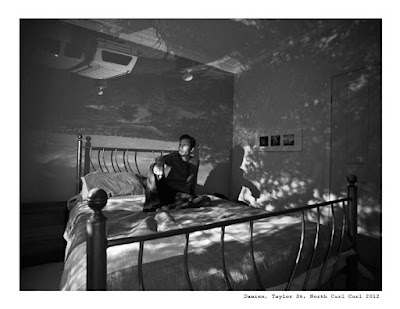
Camera Obscura

A couple of days ago, I was going through a notebook I usually use to put my thoughts and ideas on paper. I use it to write possible photography projects that I think are interesting to explore. I was reading some of the ideas I wrote in August 2011, exactly one year ago. One of those, like a bunch of others, was accumulating dust: The camera obscura.  

Just the name brings back some memories from my very first photography class, around eight years ago. That same class where my teacher showed me how to build a photographic camera with a shoe box, a photographic paper and a tiny hole in the box.

This exact same concept, was used during the Renaissance period as a drawing support for painters, but on a bigger scale of course. They used an entire dark room with a little hole in one of the walls. This is how it works, the light goes through the hole and strikes the opposite inside wall where the image from outside, is projected upside down. A couple of centuries later, they traded the room for a small box with mirrors inside. 

So, a year ago, I tried that concept in my own bedroom. The photo on the top is the result. And if we look at the photo again but upside down, you can see the view I have from my bedroom.
I don't remember the reason why I put that project on hold for so long. My intention, as far as I remember ,was to start a series of portraits of people, in their own bedrooms, with the view they see every morning, projected on them. To me it’s a portrait that tells a deeper story.

I decided to now continue that project. I guess I will start with friends, but I would love to do it with people I don't know at all, and see the final result on a print. Volunteers for a portrait are very welcome. 

Peace

Mauricio

Tuesday, August 14, 2012

The best books I read in a long time


It depends what you like of course. If you are into filmmaking these days keep reading, otherwise skip the post ;) A couple of months ago I bought a bunch of books about filmmaking. Of course before I bought them, I did a little bit of research about them. I must say I wasn’t sure if it they would help coz I read tons of books about photography before and basically it didn’t teach me anything, it was like the writer just copied and paste some notes from a student’s PowerPoint he got on his first class at uni. Anyway, the books on amazon are pretty cheap that I decided I’d give it a try.

The first one I read was ‘The DV Rebels Guide’. I consume this in only a few days!. It goes straight to the point, no BS, and Stu Mashwitz explains everything in such an easy way, that it’s awesome.  And the most important thing is, he teaches and encourages you to make a film with no budget. He shows you what an advantage it is not to be in Hollywood, not to have a big budget, or work for a big studio with great stars. He shows you that minimum budget, no fancy equipment and being your own captain can be your biggest asset. I truly loved this book.

The second book is ‘In the Blink of an eye’, a book about editing, from Walter Munch. This is another amazing book. In the first part Murch tries to find an explanation as to how the cuts work, but he approaches the entire question from a psychological point of view. Murch is an editor, a director, and a screenwriter, who has been honoured repeatedly along his career. Worked on notable films such Apocalypses Now, The English Patient, The Godfather  (part II and III) amongst other master pieces. Really an amazing source of knowledge inside this book. In the second part he writes about how he sees the future of editing. But because this book was written in 1999 this might sound a little bit out of date, but it is still awesome to read his mind and how he pictured at that time the future of editing and the filmmaking process would become in ten years.

And last but no least is ‘Rebel without a crew’ from Robert Rodriguez. This is kind of Rodriguez’ diary in which, basically, he explains how a 23 year old filmmaker with a $7,000 budget made a feature film called “El Mariachi” and created himself a space and name in Hollywood. It is a very inspiring story that forces you to think that sometimes it can pay back to just jump in the pool, make your own  film with the intention to learn as much as u can. After that, who knows, he did pretty well actually.

I learnt a lot from these books, and the funny thing is, the more theory I put in my head, the more pressure I feel, because I am now supposed to have all this knowledge and I’m worried that maybe I won’t be able to apply that knowledge and show it in a final product. It feels like the more I read, the more I postpone things. For example, I keep going back to the drawing board and make adjustments to my projects and that keeps delaying the start.  So now that I finished these books, I think the best thing to do is to not buy any more books until I do a short film first. Otherwise I will be reading forever without jumping in the pool like Rodriguez. Now is the time to action 

Tuesday, July 10, 2012

Lets put some knowledge in practice

For the last year I've been teaching myself all I can about filmmaking. The last 3 months I've been taking film courses, reading several books about filmmaking, colour grading, editing, etc. So finally I think its time to put some of that knowledge in practice.

I've been dedicating the last few weeks to write my first script and I think it's ready. Of course I know I'm not a writer, and I don't pretend to be one... but for my first short film I want to be involved in the whole process. I want to put myself in the shoes of the writer, the camera man, the editor, the sound guy, etc. Being a one man band for this film will teach me what I should expect in the future from different positions in a larger crew. Tell the story the way I want to tell it, and drive the audience to that particular place I have in mind, will be a real challenge. Now, I did my homework and I can't wait to do this.

So, basically.., I have this week left to polish the details of the story, break down the script, and make a list of everything I need, to execute it. Check what kind of gear I need to shoot each scene, what kind of time I'm gonna need for each scene, find the locations etc. And after I'm done with that list... I will start contacting you guys for favours :) 

But for sure I can say right now that if you have or know anybody who has a nice house here in the northern beaches...  and if you don't mind having a couple of actors, cameras, maybe 1 or 2 helpers and myself shooting for a few hours :) please let me know. No rush.. it's not for this weekend or the next one, just let me know, I promise it will be hell lot of fun! 

Mauricio

Monday, June 18, 2012

Tee's from Gravy Cartel back in Stock!

Good news!.., T-shirts from the Gravy Cartel are back in stock! But hurry up because, the bad news is.., these little babies are selling pretty fast! Last time I checked I only had 23 left. So if you are interested please email me, txt me, tweet me, call me..., whatever suits you best. I suggest you don't wait too long. I still have all sizes for Ladies and Gentlemen available.
secure yours at 0415639223

Monday, June 11, 2012

New lingerie range from Mariesa Mae


HOT HOT HOT! that is a good way to describe the new lingerie range from Mariesa Mae. This is a BTS from last April, when photographer Petter Karlstrom was doing the photo shoot, and I was hired to make a video documenting the whole day. It definitely was a very fun monday. Working with Petter is always fun, and Mariesa and the rest of the crew whom I met on that day were awesome. After a long day of shooting inside the Ivy, we wrapped everything and only one thing was in my head.. which song can I use? I went home, uploaded the footage, and went to bed still thinking about it.

Next morning I was having breakfast in front of the computer and started browsing different songs, and before I finished my coffee... bam! I found this track and I knew it, this was the one! I started importing everything into my editing suite, then separating the clips in two categories: one where the models are getting ready, and the second one when they have their make up and hair done. The track gives me a nice building up beat to play with, so I decided to colour grade the first half in cooler tones , and the second half, when the models are in character wearing the outfit, in warmer tones (kinda vintage, old school look). Everything fit surprisingly so smoothly that I couldn't nor wanted to stop. I changed the rhythm a couple of times, following the music and it worked pretty well. I finished the credits around midnight and delivered the video by Wednesday morning.

Hope you guys like it, you can see photos if this new line very soon at: www.mariesamae.com

PS: if you have good speakers.. please crank the volume and watch it full screen 

Friday, May 4, 2012

Crossing the line between Photography and Filmmaking

Back in 2008, I was living in Argentina, graduating after 3 years of studying photography, and this is when the 5D mark II was launched to the market… a camera that can shoot videos? No big deal I thought. Besides, I’m a photographer; I don’t need that feature... It’s been a long road since that day.

That camera created a massive revolution in the filmmaking industry because of its amazing quality of video.  And within four years, a serious war had started between companies, developing new products and gadgets relating to this new generation of HDSLR cameras.  Cinematographer’s students all around the world jumped on these cameras and started to make all sorts of movies. In the old days, you had to go to a film school, pay a big amount of money and rent expensive filmmaking equipment if you wanted to make a movie. That’s not the case anymore.

In 2009 I was already in Sydney when I met Leo, a friend who showed me for the first time what a time lapse was. One day we just went to the top of a hill, put a camera on a tripod and started shooting hundreds of photos. After that, he just put everything on his computer, edited very quickly, put a song of Eddie Vedder in the background and saved it as a movie. Wow! The result blowed my mind, and changed my entire vision. 

After that I noticed in a very clear way, that the line separating photography and filmmaking was getting thinner and thinner every year. Especially in these days, when people just want to access information faster and in the easiest way. People just got lazy in the way they consume information. If you have an article to read, and a video that explains the same thing, you would probably pick the video.

Filmmaking is a fascinating and completely different world. Photography is more like a solo type of profession. You just grab your camera whenever you want and shoot. Filmmaking is all about collaboration. In photography you are always looking for the “Decisive moment” that Cartier-Bresson's taught us. It’s all about that single and unique moment. The filmmaking is all about motion. And composition is only one of many layers. Create a good story, add sound, and edit in the right way and you can drive an entire audience into a magic journey.

I still love photography and always will. I love capturing that single moment, think and decide what to show and what to leave out of the frame. I love the fact that it is a something I can just do by myself… but… I can’t deny I’m really starting to fall for filmmaking. We live in exciting times, we can access everything we need to make a movie and tell a story. Your biggest audience is just one click away, so you don’t need a film festival to judge your movie if you don’t want to. But make no mistake; you still have to study thousands of things to do it properly. I know I will never watch a movie like when I was a kid anymore, now I see only camera movements, lighting, angles, I pay attention to the sound, music, rhythm, dialogs, color grading etc… because I know they are there for one specific reason. It’s just beautiful.

Mauricio

On the top is a behind the scenes of Ab Aeterno, that I captured through February when the brand was launched